NSF/ANR Analysis Dashboard (Summary)
| Screen ID: | INSFAN-01 | 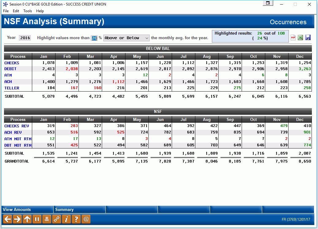
|
| Screen Title: | NSF Analysis (Summary) | |
| Panel ID: | 3769 | |
| Tool Number: | 557 | |
| Click here to magnify |
Access this screen by selecting Tool #557 NSF/ANR Statistics Dashboard.
Dashboard Tips – Questions to Ask When Comparing a Dashboard with Another Dashboard or Report
What is the NSF Analysis Dashboard?
The dashboard gives CEOs a full picture of the NSF and Courtesy Pay income credit-union wide for an entire year. Now CEOs have the power to understand their BIG picture income and to identify members who are generating it in a whole new way!
This screen is meant to be used as a trending tool to view trends over time with your NSF and Courtesy Pay income.
Some of the features of this dashboard include:
-
Full transaction counts by month, toggle to see income by month – by channel so as Congress divides these tactics you will have a full idea of the effect
-
Calculates ongoing averages throughout the year and highlights measured deviations for researching surges and drops in activity. (Deviations from a selected range appear in blue.
-
Gives quick access to the members affected by the fees by number of transactions and month to identify members needing education
-
Summary shows a summarized list of the data
-
Allows you to drill down for the members who are doing the most and being most affected by your policies and their usage
What Does this Screen Show Me?
Use this dashboard understand trends in your NSF and Courtesy Pay (Automated Non-Return) income and how your members are generating income via these channels. This tool is not meant to be have a one-to-one correlation between the numbers on the amounts view and the occurrences view.
-
Green highlights indicate that the amount is above the percent tolerance selected at the top of the screen. Red highlights indicate that the amount is below the percent tolerance selected at the top of the screen.
It is important to understand the difference between amounts and occurrences.
-
Amounts report on the fee amounts that were charged for the use of NSF or Non-Return services which is configured on the NSF and Overdraft configuration.
-
Occurrences report on the number of times that the account was hit for NSF or Non-Return services. A transaction might be hit twice, once for NSF and the next day for ANR (if the member deposited funds in his or her account that evening) so a transaction could conceivably receive two “occurrences” but only one fee. (Be sure to pay attention to whether you fee on available or current balance. This is configured on the Overdraft Protection/ANR Activation screen.) This screen also works in conjunction with any ANR Fee Cap configured in the NSF/Overdraft Protection Master Configuration.
For more discussion on what is included in this screen, refer to the help of the NSF Statistics Summary which shows the same data over the course of several years for a single member.
How Do I Use This Screen?
The main sections of the screen are separated into Courtesy Pay (Automated Non-Return) income and NSF income. Using View Amounts/View Income you can toggle between income (amounts) and occurrences. (What is selected appears in the upper right hand corner of the screen.) These figures are broken down by individual fees within each category by month with a sub total by month and a grand total of all fees per month (ANR and NSF). Use the View Trends and View Distribution buttons at the bottom of the screen to view graphical representations of the data (either occurrences or amounts). Use Summary to view a summarized listing of fees charged (this will show a summary of either counts or amount, depending on what you have selected on this screen.
At the top of the screen you can select to highlight values on the dashboard that are out of a standard range. Where are there large deviations month to month? Select to highlight values that are either “above or below,” or simply “above,” or “below” a selected percentage for the monthly average for the year. The screen will highlight the figures in the dashboard below that fall outside of this range and will notate how many figures are highlighted in the upper left hand corner of the screen.
-
Green highlights indicate that the amount is above the percent tolerance selected at the top of the screen. Red highlights indicate that the amount is below the percent tolerance selected at the top of the screen.
To determine which members are generating the income for your credit union for specific fees on the list select a specific fee from the list (ANR or NSF). A new screen will appear where you can select the specific number of transactions and a selected month. Press Enter and a listing of the members falling into this category will appear. Select a member from this listing and a detail of the NSF fees charged to that member for the year will appear on the screen.